
Originally written: June 2024
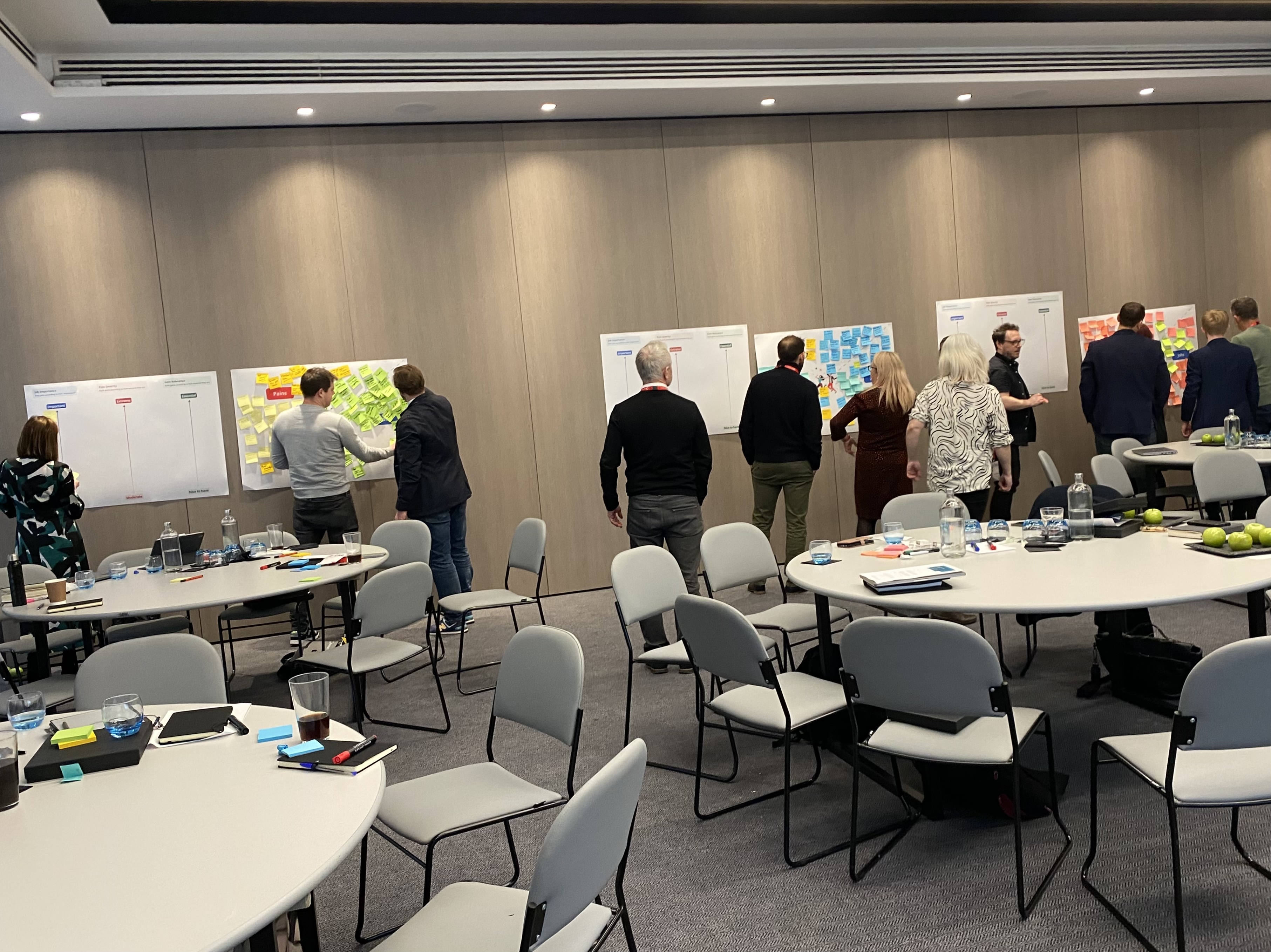
We ran a workshop last month. Fee earners, PMs, devs, UX – all in a room for a day to find one thing we could ship quickly that would prove AI could deliver real value to lawyers, not just look good in a demo.
The fee earners kept circling back to the email. Not the volume – they're used to the volume. The tone. The clients are chasing. The opposing counsel is needling. The Friday-afternoon panic that arrives when someone's already left for the weekend. A good fee earner reads the tone in two seconds. A tired one misses it, and a relationship is dented before anyone notices.
If AI could read tone too – and surface the emails that needed reading first – we'd save someone an afternoon.
The catch: nobody's doing this. Every AI demo I see right now is a chatbot or a summariser. Nobody's running an LLM permanently across an inbox just to flag the ones with bite.
So we built one. We shipped it last week.
This post is about how we got there – what we mapped before we started designing, what AI is doing under the hood, what we made the central feed platform change to make it work, and why this small card was a harder design call than anything else in the project.
Our perspective on AI-native notifications
A normal notification has fixed content. "Your meeting with Sarah starts in 15 minutes." The system knows the meeting, knows the time, knows the person. Designing the card is mostly typography.
An AI-native notification has none of that. The system flagged this email because an LLM thought the tone was off. The "content" is whatever the LLM says about it. The user doesn't know why this card showed up, and we can't tell them the same words every time, because they change.
That's the design problem. You're not designing a notification. You're designing a container for an LLM's judgement in a place where the user expects certainty.
Get that wrong, and you've built a piece of UI that says "trust me, this is important" without ever showing why. People learn to ignore those.
What we considered
Before settling on the final design, we mapped the options. We explored three approaches:
First, the dream: envision every possible AI alert feature. Notification triggers and management, user preferences, granular controls for frequency and delivery, personalisation, centralised control, feedback, and multiple settings. The idea was to be exhaustive, assuming users would want maximum control. We brainstormed extensively, even creating a Post-It wall for notification triggers and management alone.
Simple. A warning icon, a clear bold title, and a one-line summary. No body. No quoted content. Trust us, this email is bad. Read it.
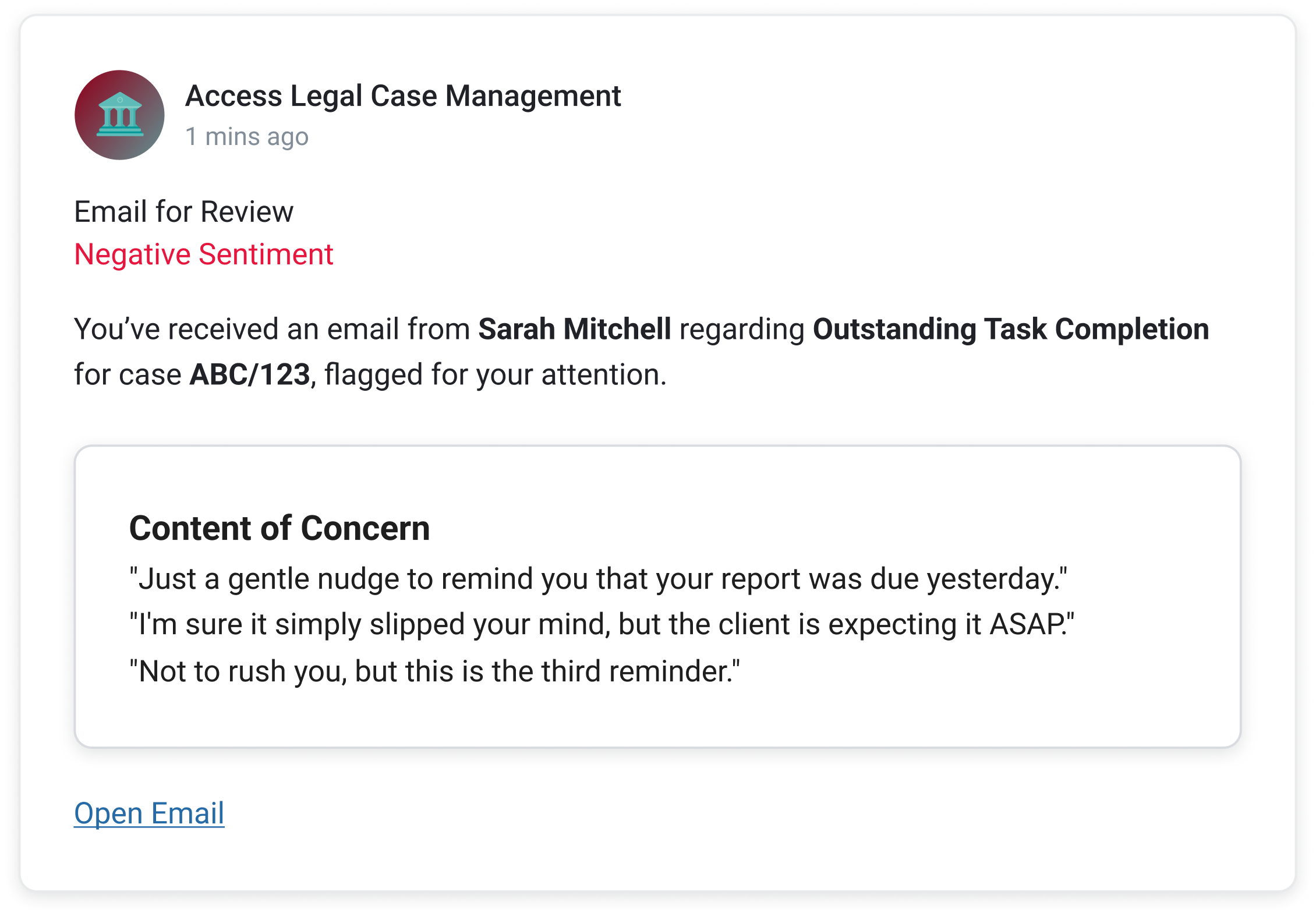
The middle. What we eventually shipped. Sentiment label, summary line, the actual phrases the LLM picked up on, one action.
The dream was lost first. It was building an entire AI control panel before we had any evidence that users wanted to control it. The simple version was lost next, in a quieter way – the moment we wireframed it, you could feel the trust gap. Why is this one bad? You couldn't ask the card; you had to open the email to find out. Which defeats the point of the card.
The middle version showed the AI's working without asking the user to configure it. We went with that.
The four moves we made
Lead with the sentiment, not the sender. A standard email notification leads with who. Sarah Mitchell. Subject line. Preview text. The user reads it like every other email card they see. We flipped it. The first thing on our card is a label – Negative Sentiment, in red. The sender comes second. The point isn't who emailed; the point is we think you need to read this one before the others.
Show the AI's workings. This was the hardest call. The LLM is making a judgment on a sliding scale – slightly chasing, firmly chasing, openly hostile. A demanding client who has every right to chase isn't the same as opposing counsel needling, but the model can read both as "negative." If we surfaced every email the model had any concern about, fee earners would learn to ignore the card inside a week. We tuned the threshold up – only items the model is confident about – and we don't ask the user to trust the call. We show it. The "Content of Concern" panel pulls the actual phrases the LLM picked up on. "Just a gentle nudge to remind you that your report was due yesterday." The user can see in three seconds whether they agree. Even when they don't, they leave understanding what the system is doing. That second part matters more than the first.
One action only. The early designs had a row of buttons – Reply, Forward, Open, Dismiss. The fee earners didn't want any of them. They wanted one thing: get me to the email. We cut everything else. Open Email. That's it. The card's job is to surface, not to handle.
Make Feed do what we needed it to. Feed wasn't built for this. A standard Feed item has a title, a description, a due date, an inline action, and a deep link. Five fixed slots. What we needed was a sixth – a structured content slot that could render variable LLM output as a bordered panel inside the card, with its own internal heading. Content of Concern. Three quoted phrases. Italic. We took a working prototype to the central Evo Feed team and asked them to extend the spec. They did. Anything else in the company that wants to build an AI-native Feed item now uses what we pushed for.
A word about 'essential'
This card doesn't live in isolation. It lives inside Access Feed, and Feed has an AI prioritisation layer called Essential that elevates the user's three most important items at the top of the list. A sentiment-flagged email needs to win that fight. If it doesn't make sense, a tired fee earner scrolls past it.
That changed the brief in a small but important way. The card has to read in less than two seconds, not because users are impatient, but because the card next to it is also fighting for those two seconds. The label-first design is partly a response to that. Negative sentiment in red is loud enough to win, even on a busy day.
What it changed
The card looks small. It's almost the simplest thing on the screen. That was the point.
In testing this week, fee earners read the card in under two seconds, agreed with the flag in most cases, opened the email, and moved on. Nobody asked where the settings were. Nobody asked what the AI was doing. The "Content of Concern" panel did all the explaining we needed.
The bigger change was upstream. We've shifted what the central Feed team thinks a Feed item can be. Until now, it was a thin notification layer – a slot for fixed product alerts. After this, it's a delivery surface for AI judgement, with a structured content slot that the rest of the business can build inside. That's a much bigger outcome than one card flagging one email.
A note on AI-native notifications
The strange thing about this project is how much of it was about not designing things. The LLM does the heavy lifting. The Feed delivers it. Our job was to design the small frame in between and to be disciplined about what didn't go in it.
We're at the start of a stretch where every product team is going to be asked to "add AI". A lot of the resulting work will be controls and panels and dashboards bolted onto things that don't need them. The interesting work is the opposite. Design the frame, show the working, and get out of the way. Trust the user to know what to do once they can see what the system saw.


