02 – RESEARCH
Moving from assumptions to evidence.
To ground the product in reality, I designed and executed a multi-stream research initiative. I combined a quantitative UserZoom survey of 110+ UK legal professionals with qualitative in-person shadowing and contextual inquiries. Finally, I validated our decisions through a six-firm pilot, capturing 30+ hours of recorded feedback against real operational environments.
1
The cost of context-switching
We observed users jumping between six or more disconnected systems (like email, billing, and court portals) to progress a single case. This fragmentation directly drove my decision to architect a unified, cross-module case timeline that pulls all subsystem activity into a single feed.
2
Designing for regulatory anxiety
Missing a court deadline carries catastrophic professional liability. Because deadlines ranked as the number one priority across all research, urgency could never be hidden behind navigation; it had to become a dominant visual anchor.
3
The spectrum of AI trust
User trust varied sharply by risk. Fee earners accepted help with routine admin but rejected automated high-stakes choices. This became our governing framework: AI must act as a contextual recommender, never an autonomous decision-maker, leaving the final override to the user.
4
Performance as a core UX metric
For lawyers billing by the hour, speed is the ultimate threshold for adoption. If the cloud UI felt slower than their snappy legacy desktop app, the launch would fail. We treated performance as our primary design constraint, optimising layout complexity to protect user speed.
A course-correction engine, not a validation exercise. Between November 2025 and January 2026 I took CaseMatters Evo to six UK firms, engaging 40+ participants across IT, compliance, and fee earners. I treated the pilot as a stress test to surface friction, not confirm the win – categorising every finding as critical, quick win, roadmap, or parking lot, and feeding it straight back into the design loop.
03 – DECISIONS
Four pivotal decisions that shaped the product.
Five decisions defined how the platform balanced regulatory rigour, adoption speed, and cognitive load.
DECISION 01
Designing for 'Decision-First' Workflows
Traditional legal software leans on rigid item lists. I designed a system that prioritises active decision-making over static box-ticking. Structuring workflows around system events let engineering lean on near-zero-cost serverless states, cutting operational overhead for small firms.
Decision 02
The Action Desk (replacing navigation)
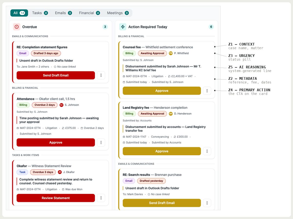
Fee earners lacked a single starting point for their day. The Action Desk organises everything by urgency and context, so users scan one repeating card pattern and evaluate priorities in milliseconds rather than hunting through menus.
Decision 03
Simplifying a 25-status financial ledger
Legal accounting demands strict compliance, but showing all 25 transaction states at once caused instant overload. I built a single-word-and-colour-coded status system with a default "Clean View" that collapses treated and audited rows – keeping the daily interface clean while the full compliance trail stays one click away.
Decision 04
Shifting from "time badges" to explicit logic
Early concepts showed time-saving badges like "Save 5 mins". Testing proved lawyers don't think about abstract time – they think about risk. So the interface names the actual stake, not a generic efficiency claim.
Decision 05
Gating AI behind human confirmation
Because solicitors carry personal professional liability, a wrongly filed document has regulatory consequences, not just workflow ones. No AI feature auto-executes. The challenge was making confirmation frictionless enough that it never felt like a bottleneck — the suggestion sits in the case timeline, states its reasoning, and waits.
04 – Delivery
Compressing a 3-year roadmap into 8 months.
To hit an aggressive eight-month H1 deadline without sacrificing quality, I turned the design system into an engineering force multiplier — translating validated Figma components into structured layout tokens and primitives that generated clean, production-ready front-end handoff.
This speed was only possible because of clear product boundaries. I structured the PRD to define functional scope rather than visual layout, giving design the autonomy to iterate on complex information architecture. We validated every feature against the legacy data model via the bridge team, and never designed for data that didn't exist — if a feature lacked an underlying data equivalent, it was cut from the MVP rather than built speculatively.